Punjung Adi Nugroho
UI/UX Designer
Photographer
Mobile Developer
Web Developer
Sr.Engineer Surface Facilities
Sr.Engineer Reliability
Sr.Engineer Turbomachinery
SAP PM Practitioners
RCM Practitioners
Risk Management Certified
Maintenance Planner
Project Planning
Sr.Project Engineer
Cybersecurity Engineer
Punjung Adi Nugroho Portfolio
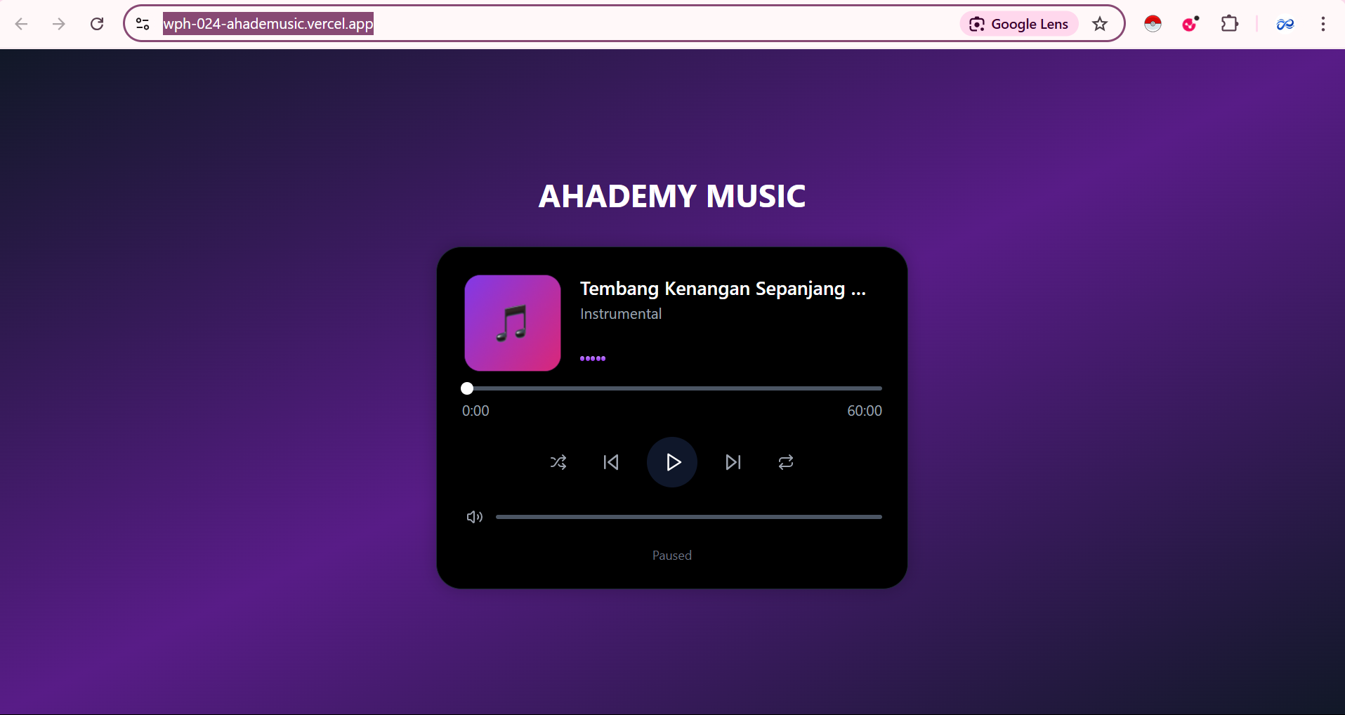
Music Player Animation WEBSITE
LINK VERCEL DEPLOYMENT: https://wph-024-ahademusic.vercel.app/
LINK MUSIC: MUSIC PLAYER
Your task is to create an interactive music player component with smooth animations using React and Motion for React. The design specifications are provided in the Figma file, and all design tokens are already implemented in the project.
- Design: Figma Design File
- Final Result Reference: View "Practice 3: Music Player Controls" at the bottom of this page
- Design System: All colors, spacing, and design tokens are implemented in
globals.css - Typography: Extended typography classes are available in
tailwind.config.ts(e.g.,display-2xl-boldas an alternative todisplay-2xl font-bold) - Spacing: Custom spacing unit is set to 1px (1:1 ratio) instead of Tailwind's default 4px (1:4 ratio). This means:
p-1= 1px (not 4px)p-4= 4px (not 16px)p-16= 16px (not 64px)
The music player should have three distinct states:
- Playing
- Paused
- Loading (transitional state between playing/paused)
Animate the container's background color and box shadow based on the current state:
- Duration: 300ms
- Easing: Default ease
- Apply different shadows for playing (purple glow) vs paused states
- Transform: Continuous 360 degree rotation
- Duration: 20 seconds per full rotation
- Easing: Linear
- Behavior: Infinite loop, only when playing
Animate scale changes between states:
- Playing: scale(1)
- Paused: scale(0.95)
- Loading: scale(0.9)
- Duration: 300ms
- Easing: Spring animation recommended
Each bar should animate independently:
- Property: Height (from 20% to 100%)
- Duration: 500ms per cycle
- Direction: Alternate (back and forth)
- Repeat: Infinite
- Easing: ease-in-out
Create a wave effect by staggering animations:
- Delay: 100ms
- Example: Bar 1 (0ms), Bar 2 (100ms), Bar 3 (200ms), etc.
- Paused: All bars at 20% height
- Loading: All bars at 50% height with 0.5 opacity
- Transition Duration: 300ms
- Smooth width transitions as the song progresses
- Duration: 300ms for state changes
- Color changes based on playing/paused state
- Hover: Scale to 1.05
- Active (tap): Scale to 0.95
- Transition: Spring animation
- Loading State: Disabled with gray background
- Hover: Color transition to white
- Active State: Visual feedback on press
When toggling between playing and paused:
- Button enters loading state
- Wait 500ms (simulate async operation)
- Transition to new state
- Update all animated elements accordingly
- Fill color transitions from neutral to purple on hover
- Duration: 200ms
Consider using Motion for React's variant system to manage the three states (playing, paused, loading) efficiently:
const variants = {